
The Data Storytelling Guide is designed to support finance professionals working in the public domain to translate facts, numbers, and their expert knowledge into stories, that are comprehensible and relatable. It follows a skills-based approach, whereby data storytelling is viewed as a key skillset to acquire what CIPFA identifies as one of the core competencies for public sector finance professionals: communication and impact.
- Chapter 1. From Reporting to Communicating
- Chapter 2. The Data
- Chapter 3. The Narrative
- Chapter 4. The Language
- Chapter 5. Visualization
- Chapter 6. Putting it all Together
- Chapter 7. Ethical Aspects of Data Storytelling
- Report download
Chapter 1. From Reporting to Communicating
References:
 Knowles, S. (2018). Narrative by numbers. How to tell powerful and purposeful stories with data. New York. Routledge.
Narrative by Numbers shows readers how to tell powerful and purposeful stories using data and statistics as the foundations. It provides the tools, tips, and tricks to use data with more impact when crafting stories and shows how powerful the combination can be. On top of this, it is also an entertaining read.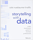 Nussbaumer Knaflic, C. (2015). Storytelling with data. A data visualization guide for business professionals. Wiley, New Jersey.
Storytelling with Data teaches the fundamentals of data visualization and how to communicate effectively with data. This book demonstrates how to go beyond conventional tools to reach the roots of data and use data to create an engaging, informative, compelling story that stays with the audience. Moretti, D. (2018). Rationalising government fiscal reporting: Lessons learned from Australia, Canada, France and the United Kingdom on how to better address users’ needs. OECD Journal on Budgeting.
In OECD countries, fiscal reports are increasingly sophisticated, highlighting governments’ commitment to fiscal transparency and accountability towards parliaments and citizens. However, users regularly express concerns with these documents, revealing a fundamental “paradox” with government fiscal reporting: desire for detail and sophistication may come at the expense of clarity. CIPFA (2020). Key Competencies for Public Sector Finance Professionals.
Helping public finance professionals respond to today’s challenges and prepare for tomorrow’s issues are central to CIPFA’s mission. Identifying and mastering key competencies is a vital first step on a lifelong learning journey. This document summarizes the key competencies believed to be required by public finance practitioners working within and alongside the public sector.
Data Storytelling Examples:
 Ministry of Finance, Singapore
The Ministry of Finance in Singapore has produced a two-page leaflet with key messages (policy objectives) from its annual budget. The main points are condensed into as few words as possible; however, QR-codes give the interested reader access to detailed information.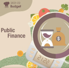 Information Service Department, Hong Kong: Video 1 and Video 2
In two short, animated videos, the Government of Hong Kong special administrative region of the People’s Republic of China explains its budget constraints and how it plans to boost revenue. Both video clips end with a QR-code giving the viewer access to more information.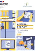 Ministry of Finance, France
The French Ministry of Finance has employed a modern design for its annual report focusing on milestones for the year, achievements, and performance indicators. Infographics and illustrations make it user-friendly and easy to read. Auckland Council Group, New Zealand
The Council of Auckland, New Zealand, presents its annual report in a very appealing summary with many images to trigger emotions. It presents a (success) story and guides readers through the numbers and data by means of various infographics and visualizations. The overall effect is an enjoyable read without being overwhelmed by too much data and numbers. Office of the Auditor General, Somalia
The Office of the Auditor General of Somalia presents its report in an animated two-minute video on Twitter, highlighting what they did, how they did it, and what they found. It also includes links to more detailed information. City of Toronto, Canada
The annual report by the City of Toronto, Canada, tells the story of what most affected the fiscal year 2020 – the COVID-19 pandemic. In addition, it includes an appealing visualization of how taxpayer money was spent, illustrated by one single dollar split into the essential public services. Swiss Ski Sport Federation, Switzerland
Swiss Ski – Switzerland’s winter sports federation – has fully digitalized its annual report, basing it on big and small success stories throughout the year. The information is supplemented with short video clips and is fully interactive, allowing the readers to explore further anything that interests them. It is only available in French and German.
Chapter 2. The Data
References:
 Knowles, S. (2018). Narrative by numbers. How to tell powerful and purposeful stories with data. New York. Routledge.
Narrative by Numbers shows readers how to tell powerful and purposeful stories using data and statistics as the foundations. It provides the tools, tips, and tricks to use data with more impact when crafting stories and shows how powerful the combination can be. On top of this, it is also an entertaining read.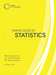 Sense about Science (2010), Making Sense of Statistics. What statistics tell you and how to ask the right questions. London.
Sense about Science is an independent campaigning charity that challenges the misrepresentation of science and evidence in public life. This guide provides a source of questions you can ask and pitfalls to avoid. In addition, knowing something about statistics can help you test and debunk arguments and get closer to working out what the figures may actually be telling us. F. Provost & T. Fawcett (2013), Data Science for Business. What You Need to Know About Data Mining and Data-Analytic Thinking. O’Reilly Media, Sebastopol.
This book introduces the fundamental principles of data science and walks you through the “data-analytic thinking” necessary for extracting useful knowledge and business value from the data you collect. This guide also helps you understand the many data-mining techniques in use today. TED Talk by Mona Chalabi: Three ways to spot a bad statistic.
Sometimes it’s hard to know which statistics are worth trusting. But we shouldn’t discount stats altogether. Instead, we should learn to look behind the figures. In this delightful, hilarious talk, data journalist Mona Chalabi shares handy tips to help question, interpret, and truly understand what the numbers are saying. World Bank (2019). Benchmarking Guide: Integrating PSA and GFS.
The Benchmarking Guide for Integrating Public Sector Accounting and Government Finance Statistics aims to inform practitioners and public sector of accounting reforms by highlighting the similarities and differences between International Public Sector Accounting Standards (IPSAS) and Government Finance Statistics (GFS) reporting guidelines, such as the Government Finance Statistics Manual of the International Monetary Fund (GFSM 2014) and the European System of Accounts (ESA 2010).
Data Storytelling Examples:
 Audit Office Queensland, Australia
The Audit Office of Queensland, Australia, offers an interactive dashboard with municipal-based data, arranged in an appealing way that is easy to navigate. So as not to overwhelm users with data, all the information is grouped into six key areas – health, education, council, energy, water, and sport. Treasury, United States
Large numbers are hard to grasp for most people. Here, the U.S. Treasury presents an appealing overview of its annual revenue and spending by making comparisons relatable to everyday lives of the population. Town of Atherton, United States
The Town of Atherton in California provides an interactive dashboard where citizens can find information and are guided by questions such as “How much does the town spend on the police service?” An instructive video accompanies the dashboard. Department for Work & Pensions, United Kingdom
The interactive dashboard by the Department for Work & Pensions (DWP) in the United Kingdom applies various elements of a data-driven story to bring relevant information to life and present data attractively. The dashboard uses visualization elements with various graphs and figures containing sufficient data to be self-explanatory without overwhelming the reader with too much information. In addition, all the visualizations are interactive, and different data layers can be added to present a more holistic picture.
Chapter 3. The Narrative
References:
 Knowles, S. (2018). Narrative by numbers. How to tell powerful and purposeful stories with data. New York. Routledge.
Narrative by Numbers shows readers how to tell powerful and purposeful stories using data and statistics as the foundations. It provides the tools, tips, and tricks to use data with more impact when crafting stories and shows how powerful the combination can be. On top of this, it is also an entertaining read. Nussbaumer Knaflic, C. (2015). Storytelling with data. A data visualization guide for business professionals. Wiley, New Jersey.
Storytelling with Data teaches the fundamentals of data visualization and how to communicate effectively with data. This book demonstrates how to go beyond conventional tools to reach the roots of data and use data to create an engaging, informative, compelling story that stays with the audience. OECD (2021). Health at a Glance.
Health at a Glance provides a comprehensive set of indicators on population health and health system performance across OECD members and key emerging economies. These cover health status, risk factors for health, access to and quality of health care, and health resources. The analysis draws from the latest comparable official national statistics and other sources.
Data Storytelling Examples:
 TED talk by David JP Phillips: The magical science of storytelling
How do you build – very quickly – a story that captures the attention of your audience? Why is storytelling so powerful? And how do we use it to our advantage? Presentations expert David JP Phillips shares key neurological findings on storytelling and, with the help of his own stories, induces in us the release of four neurotransmitters of his choice. Department for Work & Pensions, United Kingdom
The Department for Work & Pensions (DWP) in the United Kingdom presents its annual reports – in this case, on fraud and error in the benefits system – in an appealing way with a focus on the main stories and highlighting the key message of the report. Auckland Council Group, New Zealand
The Council of Auckland, New Zealand, presents its annual report in a reader-friendly summary. It welcomes the reader to the council’s (success) story, or in their words: “This report tells the story of what we did and how we performed.” Office of the Auditor General, Republic of Zambia
The office of the Auditor General of the Republic of Zambia produces a “simplified report” that uses cartoons to tell its story. Through various illustrations, they explain their work, how it relates to the everyday life of citizens, and why it is important. Examples range from unregistered businesses to increased health spending due to pollution. Ministry of Finance, Singapore
In this short, illustrative video, the Ministry of Finance in Singapore explains the fiscal constraints brought about by the COVID-19 pandemic and how investments today create value for the future. In a straightforward way, the video tells the story of why long-term budgetary planning and fiscal sustainability are essential for the country.
Chapter 4. The Language
References:
 Knowles, S. (2018). Narrative by numbers. How to tell powerful and purposeful stories with data. New York. Routledge.
Narrative by Numbers shows readers how to tell powerful and purposeful stories using data and statistics as the foundations. It provides the tools, tips, and tricks to use data with more impact when crafting stories and shows how powerful the combination can be. On top of this, it is also an entertaining read. Nussbaumer Knaflic, C. (2015). Storytelling with data. A data visualization guide for business professionals. Wiley, New Jersey.
Storytelling with Data teaches the fundamentals of data visualization and how to communicate effectively with data. This book demonstrates how to go beyond conventional tools to reach the roots of data and use data to create an engaging, informative, compelling story that stays with the audience. U.S. Treasury (2022). Financial Report of the United States Government.
The Fiscal Year 2021 Financial Report presents the U.S. government’s current financial position and condition and discusses key financial topics and trends. The financial report is produced by Treasury in coordination with the Office of Management and Budget, which is part of the Executive Office of the President. World Bank (2019). Benchmarking Guide: Integrating PSA and GFS.
The Benchmarking Guide for Integrating Public Sector Accounting and Government Finance Statistics aims to inform practitioners and public sector of accounting reforms by highlighting the similarities and differences between International Public Sector Accounting Standards (IPSAS) and Government Finance Statistics (GFS) reporting guidelines, such as the Government Finance Statistics Manual of the International Monetary Fund (GFSM 2014) and the European System of Accounts (ESA 2010). PEFA (2018). Volume II: PEFA Assessment Fieldguide.
The Public Expenditure and Financial Accountability (PEFA) program provides a framework for assessing and reporting on the strengths and weaknesses of public financial management (PFM). A PEFA assessment incorporates a PFM performance report for the government at a given time, but the methodology can be used in successive assessments, providing a summary of changes over time.
Data Storytelling Examples:
 Ministry of Finance, Singapore
The Ministry of Finance in Singapore has produced a two-page leaflet with key messages (policy objectives) from its annual budget. The main points are condensed into as few words as possible; however, QR-codes give the interested reader access to detailed information.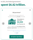 Treasury, United States
Large numbers are hard to grasp for most people. Here, the U.S. Treasury presents an appealing overview of its annual revenue and spending by making comparisons relatable to everyday lives of the population. Ministry of Finance, Liberia
In their “Citizens’ Guide to the National Budget”, the Ministry of Finance in Liberia thoroughly explains the budget process and how money is collected and spent in an easy-to-read way. The information is supported by plenty of illustrations and comprehensible language. Ministry of Finance, Namibia
The Ministry of Finance in Namibia produces a “Citizens Guide to the National Budget”, which explains the government’s budget in English and seven other local languages to ensure inclusiveness in public finance communication. It also uses some pre-attentive attributes to highlight the main findings in each language. Readability check, readable.com
The website readable.com offers free (basic) readability checks to test how understandable – or not – your documents and texts are. It does so by applying different readability grade levels equal to the years of education an average person would need to understand the text. One of these references is the Gunning Fog Index, which suggests a grade level of 6 to 8 for any text that the general public is expected to understand.
Chapter 5. Visualization
References:
 Iliinsky, N., & Steele, J. (2011). Designing Data Visualizations. O’Reilly Media, Sebastopol.
Data visualization is an efficient and effective medium for communicating large amounts of information, but the design process can often seem like a complex, creative endeavor. This concise book aims to demystify the design process by demonstrating how to use linear decision-making to encode information visually. It focuses on various types of visualization, including infographics and visual art, and explores the influences at work in each one. Nussbaumer Knaflic, C. (2015). Storytelling with data. A data visualization guide for business professionals. Wiley, New Jersey.
Storytelling with Data teaches the fundamentals of data visualization and how to communicate effectively with data. This book demonstrates how to go beyond conventional tools to reach the roots of data and use data to create an engaging, informative, compelling story that stays with the audience. Mike Ploger (2022). Five Data Storytelling Tips to Improve Charts and Graphs. Visme.
This video explores five helpful data storytelling tips that show how to create better and more persuasive data visualizations. You will also learn how our brains process visual stimuli and how you can use these principles to improve your charts and graphs.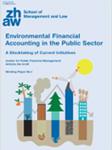 Grafl A. (2021). Environmental Financial Accounting in the Public Sector – A Stocktaking of Current Initiatives.
Environmental Financial Accounting (EFA) is an approach to financial reporting in which entities report on their exposure to and management of the financial and non-financial impacts of climate change. While EFA is gaining ground in the private sector, its conceptualization and use in the public sector is still in the early stages.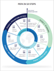 PEFA (2018). Volume I: The PEFA Assessment Process – Planning, Managing, and Using PEFA.
The Public Expenditure and Financial Accountability (PEFA) program provides a framework for assessing and reporting on the strengths and weaknesses of public financial management (PFM). A PEFA assessment incorporates a PFM performance report for the government at a given time, but the methodology can be used in successive assessments, providing a summary of changes over time. Severino Ribecca (2022). The Data Visualization Catalogue.
The Data Visualization Catalogue is a project developed to create a (non-code-based) library of different information visualization types. The website serves as a learning and inspiration resource for those working with data visualization. It contains a vast array of different visualization types with detailed descriptions. For each type, there is also a series of links with the best tools to create the respective visualization.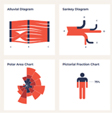 The Data Viz Project (2022). Ferdio.
The Data Viz Project website offers a wide range of visualizations, so you can find the best one for your needs or even be inspired to make your own. It also allows the user to search and filter visualizations by input, function, or shape and provides examples and a detailed description for each type. From Data to Viz (2018).
From Data to Viz helps you find the most appropriate graph for your data. It lists typical caveats you should avoid and provides a decision tree based on the input data format. This leads to twenty formats representing the most common dataset types. For each, an example of analysis based on real-life data is provided. The project is built on two underlying philosophies: (i) that most data analysis can be summarized in about twenty different dataset formats, and (ii) that both data and context determine the appropriate chart. Datawrapper (2022). Datawrapper GmbH.
Datawrapper lets you present your data as attractive charts, maps, or tables with just a few clicks. It does not require any skills in design or coding and is free of charge. ICONS8 (2022)
This website offers a wide range of icons, illustrations, photos, music, and design tools in various styles. Many of the design elements can be downloaded free of charge or for a small charge. Canva (2022)
Canva is an online design and publishing tool whose mission is to empower everyone in the world to design anything and publish anywhere. After registration, the website offers a free-of-charge tool to create your own designs and a selection of ready-to-use templates. Infogram (2022)
Infogram is an intuitive visualization tool that empowers people and teams to create attractive content. It offers a free basic package to design simple visualizations or object animations with a limited number of charts and map templates included. Freepik (2022). Freepik company
Freepik contains 27 million images, some of which are free of charge. For a monthly subscription, users have access to all the images, which include illustrations, photos, and mockups.
Data Storytelling Examples:
 City of Sugarland, United States
The City of Sugar Land in Texas presents five key indicators on its main dashboard site and uses these to justify its claim to be a “responsible city government”. By reducing content to a handful of indicators, the amount of data presented is easy to follow. In addition, the dashboard is interactive, so further information and more detail are just one or two clicks away. Office of the Auditor General, Republic of Zambia
The office of the Auditor General of the Republic of Zambia produces a “simplified report” that uses cartoons to tell its story. Through various illustrations, they explain their work, how it relates to the everyday life of citizens, and why it is important. Examples range from unregistered businesses to increased health spending due to pollution. Counties of Leeds and Grenville, Canada
This concise and informative video about how municipal finance works focuses on property tax in the counties of Leeds and Grenville in Ontario, Canada. The calculations are explained in an easy-to-follow format and explain how the tax rate might change owing to various developments. National Audit Office, Gambia
The National Audit Office of the Gambia has produced a series of short, informative leaflets that present an overview of their role and the findings and recommendations of various audits. For example, the “Audit of the Financial Statements of the Government of the Gambia for the Financial Year 2017” highlights three key findings which are easily visible at first glance. City of Toronto, Canada
The annual report by the City of Toronto, Canada, tells the story of what most affected the fiscal year 2020 – the COVID-19 pandemic. In addition, it includes an appealing visualization of how taxpayer money was spent, illustrated by one single dollar split into the essential public services.
Chapter 6. Putting it all Together
References:
 Nussbaumer Knaflic, C. (2015). Storytelling with data. A data visualization guide for business professionals. Wiley, New Jersey.
Storytelling with Data teaches the fundamentals of data visualization and how to communicate effectively with data. This book demonstrates how to go beyond conventional tools to reach the roots of data and use data to create an engaging, informative, compelling story that stays with the audience.
Data Storytelling Examples:
 Ministry of Finance, Liberia
In their “Citizens’ Guide to the National Budget”, the Ministry of Finance in Liberia thoroughly explains the budget process and how money is collected and spent in an easy-to-read way. The information is supported by plenty of illustrations and comprehensible language. Department for Work & Pensions, United Kingdom
The interactive dashboard by the Department for Work & Pensions (DWP) in the United Kingdom applies various elements of a data-driven story to bring relevant information to life and present data attractively. The dashboard uses visualization elements with various graphs and figures containing sufficient data to be self-explanatory without overwhelming the reader with too much information. In addition, all the visualizations are interactive, and different data layers can be added to present a more holistic picture. Auckland Council Group, New Zealand
The Council of Auckland, New Zealand, presents its annual report in a very appealing summary with many images to trigger emotions. It presents a (success) story and guides readers through the numbers and data by means of various infographics and visualizations. The overall effect is an enjoyable read without being overwhelmed by too much data and numbers. Office of the Auditor General, Somalia
The Office of the Auditor General of Somalia presents its report in an animated two-minute video on Twitter, highlighting what they did, how they did it, and what they found. It also includes links to more detailed information. Office of the Auditor General, Republic of Zambia
The office of the Auditor General of the Republic of Zambia produces a “simplified report” that uses cartoons to tell its story. Through various illustrations, they explain their work, how it relates to the everyday life of citizens, and why it is important. Examples range from unregistered businesses to increased health spending due to pollution. Department for Work & Pensions, United Kingdom
The Department for Work & Pensions (DWP) in the United Kingdom presents its annual reports – in this case, on fraud and error in the benefits system – in an appealing way with a focus on the main stories and highlighting the key message of the report.
Chapter 7. Ethical Aspects of Data Storytelling
References:
 Knowles, S. (2018). Narrative by numbers. How to tell powerful and purposeful stories with data. New York. Routledge.
Narrative by Numbers shows readers how to tell powerful and purposeful stories using data and statistics as the foundations. It provides the tools, tips, and tricks to use data with more impact when crafting stories and shows how powerful the combination can be. On top of this, it is also an entertaining read. Sense about Science (2010), Making Sense of Statistics. What statistics tell you and how to ask the right questions. London.
Sense about Science is an independent campaigning charity that challenges the misrepresentation of science and evidence in public life. This guide provides a source of questions you can ask and pitfalls to avoid. In addition, knowing something about statistics can help you test and debunk arguments and get closer to working out what the figures may actually be telling us. OECD (2022). Draft Principles of Good Practice for Public Communication Responses to Mis- and Disinformation.
This OECD draft paper addresses recent developments in the use and misuse of (government) data. It suggests a set of principles concerning how governments could limit the spread of mis- and disinformation content in a holistic manner, and in turn rebuild trust in the information ecosystem and democratic institutions. OECD (2020) Good Practice Principles for Data Ethics in the Public Sector.
These good practice principles seek to shed light on the value and practical implications of data ethics in the public sector. Their aim is to support public officials in the implementation of data ethics in digital government projects, products, and services. The document introduces ten good practice principles for data ethics in the public sector, including a set of specific steps to support their implementation.
Data Storytelling Examples:
 Department for Work & Pensions, United Kingdom
The Department for Work & Pensions (DWP) in the United Kingdom supplies additional information on their dashboard regarding the accuracy of their data. This is done by fully explaining the methodology and any changes to it and disclosing the limits of their data by highlighting uncertainties and confidence intervals. Central Digital and Data Office, United Kingdom
The Central Digital and Data Office – part of the UK government – has developed a “Data Ethics Framework”. It promotes appropriate and responsible data use in government and the wider public sector. It also helps civil servants to understand ethical considerations and address these in their projects, as well as encouraging responsible innovation. In addition, the framework sets out specific steps that can be taken at each stage of a project to advance transparency, accountability, and fairness. Ministry of Finance, Netherlands
The Ministry of Finance in the Netherlands has published a privacy statement explaining how it handles personal data. This clarifies how data are processed and shared and details the rights of individuals regarding their data.